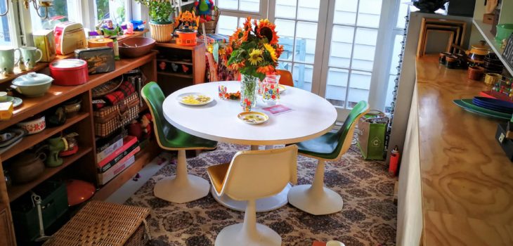
Skyline garage to “Studio”in 3 weeks!
It seems every Christmas holidays we have a project, this year’s project was to convert our 1960’s skyline garage into a studio to showcase products from our website and allow people to come visit and buy. It’s always fun to share our finds and tales of the treasure hunt

As you can imagine, the original skyline garage was packed to the roof with everything sheds have – bikes, camping gear, garden stuff etc. So the first step was to empty everything out , so to accompany these still important life essentials we took a weekend and build a kitset shed. Not hard but nothing is ever simple. The kit set was missing a roof panel so we currently have a half built shed covered with a tarp. Fingers crossed it doesn’t rain! The disadvantage to doing things at Christmas is nothing happens fast. 6 weeks later and we are still waiting for a replacement.

That’s ok, we carried on. First by doing the basics, weatherproofing. The concrete floor was sealed and painted, the roof was inspected and repaired where needed. That seemed to take forever with no noticeable change.
Next came the paint. Starting with painting the roof beams in a soft cream of Resene’s half Dutch White Zylone. Then colour on the walls. Yay! We had gibbed the walls a few years earlier so luckily we just had to paint with a Karen Walker Resene’s colour of Beryl Green. Karen Walker’s colour are great, they have depth other colours don’t seem to have. We have used them couple of times in the past half Beryl green and I am very tempted to use her version of orange to add a pop of colour. Orange is such a great retro colour. What do you think?
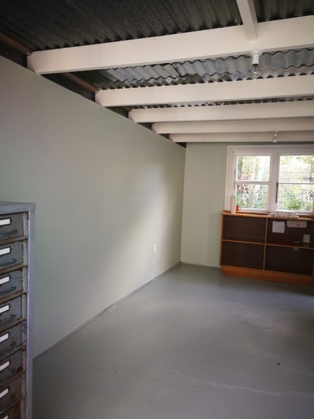
The next step was design with the shed/studio needed to be multifunctional – storage and display. The shed is really not big and only had 1 functional wall – that’s the challenge!
Storage was achieved by making cupboards along one wall with the specific purpose being to fit as many banana boxes as possible! We managed to fit 36 – mainly Crown Lynn.
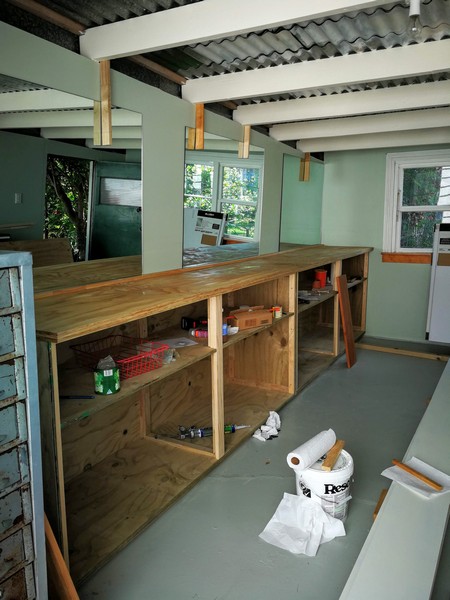
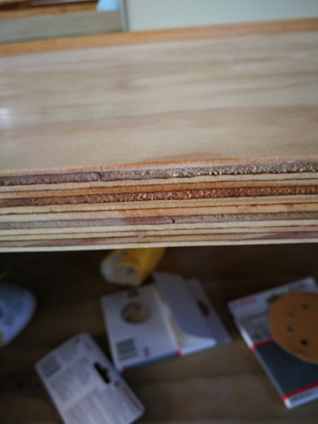
The cupboard shelves were basic but we added a plywood bench top, embracing the grain of the ply. There is something nice about keeping things basic and the grain was beautiful when polyurethraned. A bit of a Scandinavian vibe.
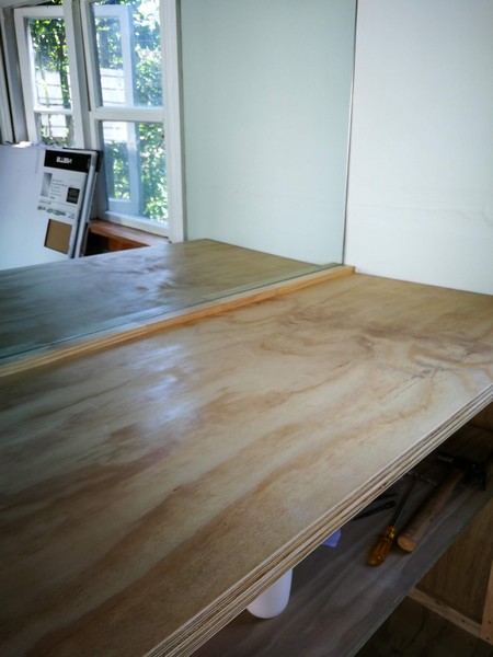
The display space was dedicated to the area above the cupboard shelves. Not that easy as nothing in this 60’s building was square and it had the classic angled roof.
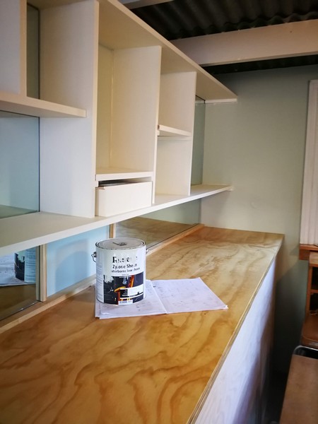
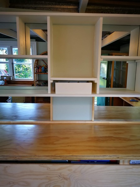
To maximize light , mirrors were placed on the wall first. They reflect the light from the opposite window and are always great for enhancing display spaces. The cheapest way to do this was to buy 3 identical mirrors- each was 120 cm x 90 cm. Large mirrors are too expensive so the challenges was how best to fit the shelves and mirrors together. Luckily it worked, the key was having the spacing between mirrors fit a designed shelf and extend the mirror down to the bench to act like a splashback.
Next came the fun, adding furniture and styling the space!

This was a very organic process with the key being trying different versions and combos to see what looked best.
After 3 long weeks of building, hopefully we achieved some which is functional and can now be called a studio. Thank goodness it was Christmas as the only thing we ate was the Holiday ham.

To give you context, everything was done by my partner and I . We are not builders or interior designers, we are just plain folk who make it happen mainly because we don’t have the financial resources to pay someone. If we can do it, you can too!
